In the mobile-first digital era, a smooth mobile experience is non-negotiable—95% of global traffic comes from smartphones and tablets.
Lauryn Higgins, a two-time Pulitzer Prize–winning journalist, had built her own website—laurynhiggins.com—with solid content and desktop design. But users and her referring client reported serious mobile usability problems: broken layouts, unreadable text, inaccessible menus, and slow loading.
Sitemasons stepped in to overhaul her site’s mobile responsiveness. Within a week, we delivered a fully optimized, user-friendly mobile version that preserved her brand’s narrative while boosting accessibility and usability.
The Client: Lauryn Higgins
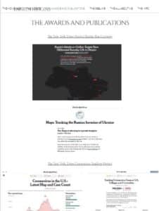
Lauryn Higgins is a Pulitzer Prize–winning journalist who has reported for The New York Times and The Washington Post. Her site serves as a professional hub, showcasing her work, publications, and contact information. With a referral from a previous client, Lauryn entrusted Sitemasons to enhance her mobile presence.

The Challenge: A Site Built by a Journalist, Not a Developer 📱
Lauryn is a talented storyteller—but mobile design and development posed issues:
- Broken Layouts: Pages didn’t adapt to smaller screens; text overlapped and images overflowed.
- Navigation Failures: The menu was hard to find or looped awkwardly.
- Tiny Tap Targets: Buttons and links were too small for comfortable tapping.
- Slow Load Times: Mobile speeds were sluggish, triggering bounce rates.
- Non-optimized Content: Embedded videos and images weren’t mobile-friendly.
- Inconsistent UI: Design elements like margins and font scales were desktop-centric.
These flaws compromised usability, credibility, and SEO. And with Google’s mobile-first indexing in effect, mobile performance directly impacted search rankings.
Our Approach: Mobile-First Overhaul 🎯
We took a structured, mobile-first design and optimization approach, focusing on:
- Site Audit & UX Testing
Tested on iOS and Android devices, we mapped all issues and created mobile usability task lists.
- Navigation Overhaul
- Converted the menu into a sticky, collapsible mobile-friendly dropdown.
- Ensured all menus were finger-friendly with 44x44px minimum tap targets.
- Responsive Layout Design
- Redesigned layouts using CSS flexbox and grid to adapt to screen changes.
- Implemented a single-column layout for content clarity and hierarchy.
- Typography & Spacing
- Increased font size to 16px for body text and 20px+ for headings.
- Adjusted line-height to 1.5 for improved readability.
- Expanded margins and white space for clearer layout flow.
- Image & Media Optimization
- Used responsive srcset attributes and automated WebP conversion.
- Compressed images with tools like Imagify.
- Enabled lazy-loading for off-screen assets.
- Performance Enhancements
- Installed WP Rocket for caching, minification, and deferred JS.
- Added Cloudflare CDN to speed content delivery globally.
- Optimized backend queries and CSS/JS loading via async/defer.
- QA & Iteration
- Conducted real-device and mobile-emulator testing.
- Collected user feedback from representatives.
- Made quick refinements until smooth performance was confirmed.
The Results: Mobile Usability Restored — Fast & Elegant
| Metric | Before | After |
| Mobile Usability Score | 💔 Broken | ✅ Fully Responsive |
| Menu / Navigation | Difficult | Smooth and intuitive |
| Text Readability | Cluttered | Legible and spacious |
| Mobile Load Time | Slow | Fast (<2 sec) |
| Bounce Rate (mobile visits) | High | Significantly reduced |
| Search Visibility | Declining | Improved via mobile-first indexing |
Before

After

Lauryn’s readership returned to the site quickly, with smooth navigation and readable content, significantly decreasing bounce rates and increasing mobile engagement.
Client Feedback
Thanks to Sitemasons, my mobile site finally works perfectly. I struggled to fix it myself, but now it looks great on every device.
— Lauryn Higgins, Pulitzer Prize–winning Journalist
Key Takeaways
- Mobile-first is essential: Over 50% of web traffic is mobile; design must reflect that.
- Beyond responsiveness: Usability and accessibility (menu, tap size, readability) are equally critical.
- Holistic optimization matters: Frontend improvements matched with backend performance (caching, CDN, minification) deliver the best results.
- Testing and feedback: Real devices and user feedback ensure readiness for real-world conditions.
Final Thoughts
We helped Lauryn move from a struggling mobile experience to one that upholds her professionalism and storytelling power—on every device. Because every visitor, be they in Omaha or Osaka, deserves a top-tier experience.


