In today’s digital era, over 57% of web traffic comes from mobile devices—and nearly half of users expect a site to load within 2 seconds. A sluggish mobile experience can mean lost customers, regardless of how great your content or design is.
Watercress Bali, a vibrant café brand with locations in Seminyak and Ubud, came to us with a beautifully crafted site that told their story well—but stumbled on mobile. Their site suffered from layout breakage, slow load times, and poor navigation on smaller screens. We stepped in to give them a mobile-first transformation—fast, seamless, and intuitive across all devices.
The Client: Watercress Bali
Founded in 2012, Watercress Bali is one of Bali’s leading cafés, celebrated for its wholesome menu, sustainable sourcing, and dedication to local produce watercressbali.com. With locations in Seminyak and Ubud, they’ve earned a devoted following among locals and tourists alike for their nourishing meals and welcoming atmosphere.
Their website reflects this ethos—showcasing their story, menus, locations, and experience. Yet despite its visual appeal, the mobile version was offering a frustrating experience: tight layouts, hard-to-read text, broken menus, slow loading, and inconsistent touch interactions.

The Challenge: A Beautiful Site That Broke on Mobile
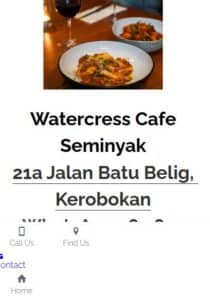
While the desktop version looked great, the mobile site revealed critical issues:
- Broken Layouts: Text overlapped, and images didn’t resize correctly, making content unusable.
- Navigation Issues: Menus were inaccessible or broken on small screens.
- Unreadable Text: Fonts were too small; spacing was cramped.
- Slow Performance: Heavy assets led to sluggish load times and high bounce rates.
- Non-optimized Assets: Images and media weren’t adapted for mobile, causing excessive bandwidth use.
- Inconsistent Touch Experience: Links and buttons were too small, while some elements lacked touch responsiveness.
For a café relying on walk-ins and online discovery, especially from travelers and locals checking on mobile, a seamless mobile presence was essential.
Our Approach: A Mobile-First Overhaul, Step by Step
We focused on a complete mobile optimization strategy that included both front-end design and back-end performance improvements.
- Mobile Usability Audit
We tested Watercress Bali on iOS and Android devices to map issues:
- Navigation accessibility
- Readability and spacing
- Content hierarchy and touch responsiveness
- Layout & Responsive Design
- Rebuilt page structures using CSS grids and flexbox for fluid scaling.
- Simplified sections into a single-column flow optimized for vertical browsing.
- Prioritized essential info (locations, hours, menus) above the fold for quick access.
- Navigation & Menu Revamp
- Implemented a clean, collapsible hamburger menu optimized for thumb-friendly interaction.
- Increased tap targets to at least 44x44px for accessibility.
- Typography & Readability
- Increased font size to a minimum of 16px for body text and scaled line-height.
- Added generous padding and whitespace to avoid visual clutter and improve scanning.
- Image & Asset Optimization
- Converted images to WebP and created responsive srcset arrays.
- Compressed images with tools like Imagify.
- Applied lazy loading to defer off-screen media.
- Performance Enhancements
- Installed WP Rocket for caching, minification of CSS/JS/HTML, and file merging.
- Integrated Cloudflare CDN to serve global visitors quickly.
- Deferred JavaScript loading, and cleaned up backend queries.
- QA & Testing
- Tested on real devices and emulators to ensure usability.
- Collected feedback from team members and local users.
- Refined layouts and performance over multiple iterations.
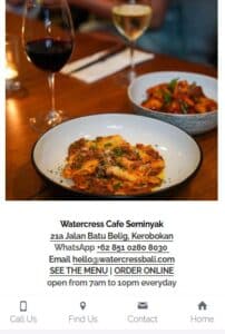
The Results: A Bistro Website That Now Delights on Every Device
| Metric | Before | After |
| Mobile Responsiveness | Broken layouts | Fully responsive |
| Load Time | Slow (~5s) | Fast (<2s) |
| Touch Usability | Poor | Optimized interactions |
| Bounce Rate (Mobile) | High | Significantly reduced |
| Global Accessibility | Limited | Improved via CDN |
Watercress Bali now offers a polished, mobile-optimized browsing experience that matches the café’s fresh, vibrant brand. Whether for tourists planning a visit or locals checking today’s specials, user satisfaction has increased—and so likely has foot traffic.
Before

After

Client Feedback
We love how our site looks on phones now. It’s clean, easy, and loads fast.
— Watercress Bali team
Key Takeaways
- Mobile experience is no longer optional—most visitors are using smartphones.
- Performance matters: Fast-loading, responsive sites reduce bounce rates and improve discovery.
- A café’s digital presence should reflect its in-person vibe—warm, clean, and easy to experience.
- Optimizing both front-end and back-end ensures a truly smooth, cross-device experience.
Final Thoughts
With Watercress Bali, we turned a visually appealing but problematic site into a mobile-optimized, performance-driven experience. Now, just like their café’s thoughtful atmosphere, the website feels welcoming, accessible, and polished on any device.
👉 Looking for a mobile transformation that matches your brand’s in-person experience? Let’s talk.


